Beta distribution
Beta distribution is a useful tool for modeling uncertanty about probabiiities/percentages/proportions. It is a continuous probability distribution with the domain of $[0, 1]$. It is also a very useful tool in Bayesian statistics, as there is a very straightforward way to get the parameters of the posterior distribution.
This blog post contains my own notes on Beta distribution, influenced by reading the “Bayesian Statistics the Fun Way” book, along with some tinkering in Python around the examples in the book.
Beta distribution is characterized by two parameters, $\alpha$ and $\beta$, representing the outcomes of a simple sequence of pass/fail trials, like coin flips or advertisement conversions:
- $\alpha$ = the number of successes (more formally, the number of times we observe an event of interest)
- $\beta$ = the number of fauilures (the number of times an event of interest doesn’t happen)
The exact definition of the PDF of Beta distribution can be looked up in the SciPy docs or on the respective Wikipedia entry.
I find it more intuiitive to think in terms of the number of successes $\alpha$ and the total number of trials $\alpha + \beta$. By the way, the ratio of $\frac{\alpha}{\alpha + \beta}$ constinutes the mean of the distribution.
Let’s take a look at an example with 14 successes out of 41 trials (ref. chapter 5). First, we import the libraries of interest and define a helper function for plotting the Beta distribution PDF:
import numpy as np
import pandas as pd
from scipy import stats
from scipy import integrate
from matplotlib import pyplot as plt


def plot_beta_distrib(distrib, cutoff=1., figsize=None):

    ps = np.linspace(0, cutoff, num=200)

    _, ax = plt.subplots(figsize=figsize)
    ax.plot(ps, distrib.pdf(ps), color='tab:blue')
    ax.axvline(distrib.mean(), color='gray', linestyle='--')
    ax.set_xlabel('p')
    ax.set_ylabel('PDF(p)')

    plt.show()
In the example below, 14 successes out of 41 trials result in a Beta distrubuting with parameters $\alpha = 14$ and $\beta = 27$:
def simple_beta_distrib_example():

    n_successes = 14
    n_trials = 41
    n_failures = n_trials - n_successes
    p = n_successes / n_trials

    print(f'Beta distribution parameters: alpha={n_successes}, beta={n_failures}')
    print(f'Mean: {p:.3f}')

    distrib = stats.beta(a=n_successes, b=n_failures)
    assert distrib.mean() == p

    plot_beta_distrib(distrib, figsize=(7.5, 2))


simple_beta_distrib_example()
Beta distribution parameters: alpha=14, beta=27
Mean: 0.341
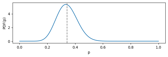
You may take a notice the distribution’s mean (dashed gray line) is not aligned with its mode. This is due to the fact that a considerable range of less likely values from the “right side” (closer to 1) contribute to the mean as well.
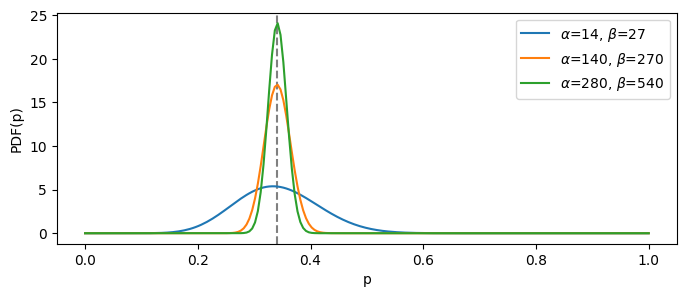
Let’s now play around with the same underlying mean probability (0.341), but imagining that we obtained it through different number of trials. The helper function below attempts to produce such $\alpha$ and $\beta$ that result in the wanted mean value given the number of trials:
def get_beta_params_for_probability(p, n_trials):

    a = round(p * n_trials)
    b = n_trials - a

    assert abs(p - a / (a + b)) <= 1e-3

    return np.array([a, b])
Now, let’s see how the respective distributions will look as we increase the total number of trials. Naturally, the more trials we take, the more certain we are, hence the distribution is tighter around the mean:
def demo_several_betas_same_mean(target_prob, base_trials_count, cutoff=1., factors=(1, 10, 20)):

    fig, ax = plt.subplots(figsize=(8, 3))
    ax.axvline(target_prob, color='gray', linestyle='--')

    legend_handles = []
    for factor in factors:

        a, b = get_beta_params_for_probability(target_prob, base_trials_count * factor)
        rv_beta = stats.beta(a, b)

        ps = np.linspace(0., cutoff, num=200)
        current_label = r'$\alpha$={}, $\beta$={}'.format(a, b)
        legend_handle, = ax.plot(ps, rv_beta.pdf(ps), label=current_label)

        legend_handles.append(legend_handle)

    ax.legend(handles=legend_handles)
    ax.set_xlabel('p')
    ax.set_ylabel('PDF(p)')


demo_several_betas_same_mean(target_prob = 0.341, base_trials_count = 41)
The next example (ref. chapter 14) concerns the problem of conversion from e-mail marketing: the number of people who subscribe to a service after they clicked the link in the e-mail. This is naturally modeled with the Beta distribution. The latter can also be used as an informative prior for Bayesian analysis.
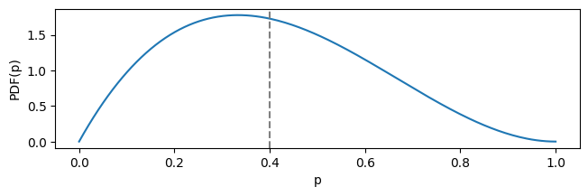
Imagine you’ve got very little data on e-mail converions, like 2 successes out of 5 trials. This corresponds to Beta distribution with the parameters of $\alpha = 2$ and $\beta = 3$ and the mean of:
print(f'mean = {2 / 5}')
mean = 0.4
This expected value is clearly too optimistic. When plotted, the distribution looks like this:
plot_beta_distrib(stats.beta(a=2, b=3), figsize=(7.5, 2))
Let’s say have a value of expected conversion rate, which is 2.4%. This means the prior probability distribution should be a Beta with the mean of 0.024. Let’s again look at several such distributions, with the increased certainty:
demo_several_betas_same_mean(target_prob=0.024, base_trials_count=42, cutoff=0.15, factors=(1, 5, 10))
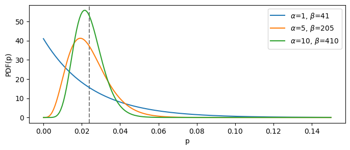
The “blue” distribution is the least informative one, since it is based on the least number of total trials ($\alpha + \beta$). It means that, if we choose it as our prior belief, it will be easiest to change given the newly observed data.
In the example below, we start with a rather uninformative prior parametrized with $(\alpha = 1, \beta = 41)$, and then check out how the posterior will look if we combine the prior with the likelihood of our data (2 successes out of 5 trials). Here we employ the simple rule of posterior calculation for two Beta distributions:
$$ Beta(\alpha_{posterior}, \beta_{posterior}) = Beta(\alpha_{prior} + \alpha_{likelihood}, \beta_{prior} + \beta_{likelihood}) $$
def bayesian_beta_example(prior_params, n_successes, n_trials):

    prior_alpha, prior_beta = prior_params
    n_failures = n_trials - n_successes

    prior = stats.beta(a=prior_alpha, b=prior_beta)
    likelihood = stats.beta(a=n_successes, b=n_failures)
    posterior = stats.beta(a=prior_alpha+n_successes, b=prior_beta+n_failures)

    fig, ax = plt.subplots(figsize=(7, 3))

    legend_handles = []
    labels = ('Prior', 'Likelihood', 'Posterior')
    distributions = (prior, likelihood, posterior)
    ps = np.linspace(0., 1., num=200)

    for current_label, distrib in zip(labels, distributions):
        legend_handle, = ax.plot(ps, distrib.pdf(ps), label=current_label)
        legend_handles.append(legend_handle)

    ax.legend(handles=legend_handles)
    ax.set_xlabel('p')
    ax.set_ylabel('PDF(p)')

    plt.show()


bayesian_beta_example(prior_params=(1, 41), n_successes=2, n_trials=5)
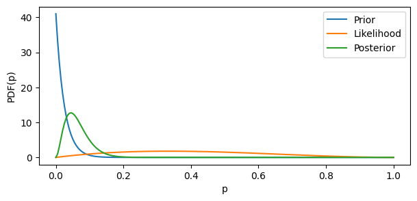
The original data likelihood was very uncertain and too optimistic. By combining it with the particularly uncertain prior “encoding” the realistic mean, we obtain a pretty realistic posterior.
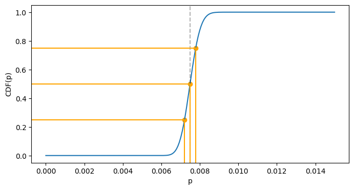
In the final example (ref. chapter 13) we will play around with CDF and the quantile function given a Beta distribution from 300 blog subscribers out of 40,000 visitors:
def describe_distrib(distrib):
    print(f'Mean: {distrib.mean():.5f}')
    print(f'Median: {distrib.median():.5f}')


blog_distrib = stats.beta(a=300, b=39_700)
plot_beta_distrib(blog_distrib, cutoff=0.012, figsize=(7.5, 2))
describe_distrib(blog_distrib)
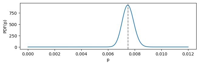
Mean: 0.00750
Median: 0.00749
This is a particularly certain/tight distribution, with mean and median values very close to each other. Median represents such value of the domain, such that probability before and after it is equal to 0.5. We can calculate actual probabilities using CDF:
def cdf_before_after_median_example(distrib):
    cdf_of_median = distrib.cdf(distrib.median())
    print(f'P(<= median) = {cdf_of_median:.3f}')
    print(f'P( > median) = {1 - cdf_of_median:.3f}')


cdf_before_after_median_example(blog_distrib)
P(<= median) = 0.500
P( > median) = 0.500
For the particular example of blog subsribers, it is interesting to compare probabilities of having the true conversion rate either 0.001 higher than the mean or 0.001 lower:
def lower_and_higher_example(distrib, tolerance=1e-3):

    lo = distrib.mean() - tolerance
    hi = distrib.mean() + tolerance

    cdf_lo = distrib.cdf(lo)
    cdf_hi = 1 - distrib.cdf(hi)

    print(f'integrating from 0 to {lo}: {cdf_lo:.3f}')
    print(f'integrating from {hi} to 1: {cdf_hi:.3f}')
    print(f'higher / lower = {(cdf_hi / cdf_lo):.3f}')


lower_and_higher_example(blog_distrib)
integrating from 0 to 0.0065: 0.008
integrating from 0.0085 to 1: 0.012
higher / lower = 1.564
Further, it can be useful to compute the values of the quantile function for the distribution at hand. Quantile function is the inverse of CDF and obtained using the ppf method of the distribution object.
Median value is the same as ppf(0.5):
assert abs(blog_distrib.ppf(0.5) - blog_distrib.median()) <= 1e-6
The last visualization shows the values of quantile function of 0.25, 0.5 and 0.75. The blue curve is the CDF, and you may trace the “inverse” mapping from the vertical axis to the horizontal one:
def get_scaled_plot_coordinate(val, limits):
    lo, hi = limits
    range_len = hi - lo
    return (val - lo) / range_len


def quantiles_example(distrib, cutoff=1.):

    ps = np.linspace(0, cutoff, num=200)

    fig, ax = plt.subplots(figsize=(8, 4))
    ax.plot(ps, distrib.cdf(ps))

    xlim = ax.get_xlim()
    ylim = ax.get_ylim()

    qs = (0.25, 0.5, 0.75)
    ppf_vals = tuple(distrib.ppf(q) for q in qs)

    ax.axvline(distrib.median(), color='black', linestyle='--', alpha=0.3)

    for q, ppf_val in zip(qs, ppf_vals):
        ax.axvline(ppf_val, color='orange', ymin=0, ymax=get_scaled_plot_coordinate(q, ylim))
        ax.axhline(q, color='orange', xmin=0, xmax=get_scaled_plot_coordinate(ppf_val, xlim))

    plt.scatter(ppf_vals, qs, color='orange')
    plt.xlabel('p')
    plt.ylabel('CDF(p)')

    plt.show()


quantiles_example(blog_distrib, cutoff=0.015)